
The wedding planning hasn’t stopped at my house, or rather,
in my head. Joseph and I are not
rich. I do not have parents who ever
planned on paying for a daughter’s wedding, because they have no
daughters. And Joseph’s family is in the
same boat, so the wedding that has really started to surface in our plans is a
very small, simple, DIY affair. I wanted
to incorporate things that Joseph and I love and want to share with our
guests. This brought me to thinking that
our wedding will be a camping adventure for the whole family and would have a
woodsy theme.
I suggested to Joseph that we should plan on serving our
wedding dinner on camping dishes. As a
teenager I always imagined that I would have speckled blue dishes for my future
house, and that my plates and mugs would be equally at home inside my log cabin
as they would out on a prairie picnic.
Joseph, on the other hand, likes tin just fine, but has an aversion to
those speckled blue dishes for reasons I have not divined. And while I was planning to use this move to
completely change out my haphazard collection of dishes for something nicer and
more matched (albeit cheap camping dishes), Joseph suggested that we allow our
guests to keep their camp dishes as a wedding gift. This I knew was Joseph trying to tell me that
he did not think highly of my speckled blue dishes.
But I wouldn’t let this go.
I could forego my speckled dishes.
In truth, I don’t like them as well as I did when I was a teenager in
North Idaho dreaming of the day I would live in my own Ted Kacynski cabin alone
in the woods. (Strangely, I never had a
wife in my fantasy of the future.) I
liked the idea that we would use part of our wedding budget to upgrade our
dinnerware into something that we would use forever. And then it hit me, we needed to pick out our
china pattern!

My Grandmother has a rather extensive collection of Currier
and Ives dishes that I love. Whenever I
see pieces of it in thrift stores and antique shops, I buy it. It has a sentimental charm for me that I
cannot resist and this was naturally the first china pattern I suggested to
Joseph when I said I was willing to give up speckled camping dishes. Joseph liked the idea of using some of the
wedding budget to upgrade our dinnerware.
He thought that a meal with our friends and family in honor of our
marriage was probably the best part of the evening, and it should be celebrated
with new dishes that we would use for the first time on that day. But he raised his eyebrows at the Currier and
Ives. That pattern, he said, was
wonderful for Gram and Grandpa. But the
pattern was always for Gram and Grandpa, it wouldn’t be our dishes. So that’s when I launched my second idea at
him: Fiestaware! Color is one of my most favorite things in
life, so what better china for a guy whose favorite color changes weekly than
china made to be mixed and matched?

Joseph’s serpentine eyebrow arched once again at this
suggestion so I let my suggestion cool.
But I was bound and determined to think of an amazing patter that both
Joseph and I would love.
Shortly thereafter, I was consulting the Sacred Oracle of
the Twenty-First Century. I am speaking,
of course, of Google. I sometimes use
its toolbar to type in my most intimate questions (knowing the whole time that
these questions will forever be linked with me and affect my advertising
experience on my websites). I began to
type “Which china pattern should I choose?”
But Google, being a sacred oracle, suggested “Which china pattern is
made in the USA?” Yes! Sacred Google, you have done it again! Joseph is a stickler for buying things that
are made in America! So I clicked on the
suggestion and the very first thing that popped up was a made in America
website that touted Fiestaware!
Armed with this new information, Joseph’s eyebrow stayed
put, and I was given the go-ahead to start planning my life in color:
Fiestaware color!

But how to choose a color, or two, or convince Joseph (who
hates rainbow weddings) to have our wedding dinner on a rainbow of dishes?
I began pouring over the Fiestaware websites and imagining
color combinations that would look good together and would keep the idea of
Frank and Joseph’s wedding alive. For
instance, while I love every color, some colors are more me than others. And the first color that I took to on the
websites was “Peacock.” In every
picture, peacock looked like the very blue of the Mediterranean, which I have
seen many times … on Google. It was an
intense blue with a vague idea of green under its surface. But how would I use this color? I wanted to mix right off the bat, so that
Joseph wouldn’t have to be persuaded later, but Peacock would be my main
starting point. Should it be Peacock,
Turquoise, and Chocolate, or Peacock and Plum with punches of Lemongrass? We almost ordered our first pieces in
Peacock, but Joseph suggested we go somewhere to see the colors in person
before we made our final decisions. Okay,
but I could already tell I loved Peacock very much. I liked the Plum and the Turquoise, too. And I absolutely hated the newest color,
Paprika.
So like a four-year-old on December twentieth waiting for
Christmas, I waited, too.
And finally, yesterday, it happened! We went to Macy’s in the Tacoma Mall, and saw
the Fiestaware for the first time with the intention to buy. And it was beautiful, all those colors paired
next to each other in stripes of cups, saucers, and medium sized canisters. Like a moth to a flame, I walked straight to
the Peacock and picked up a mug.
But something was wrong.
This was not the blue of legend I had seen so much of on my
beloved Oracle Google. This was a
primary blue. A flat, though intense sky
blue. A Crayola dream of Easter Egg
Blue. But it had none of the mysterious
notes of green beneath its glaze. When I
held it up with Turquoise, I felt a little disappointed. When I put it next to Chocolate, I felt a
little sick. And when I tried it with
Scarlett red, I felt like Superman. And
while I do love my Super Friends, I don’t want people to think of them on my
wedding day.
Joseph did not like it, either, and his stupid eyebrow made
no bones about telling me. I’m sure
Peacock is just fine for many people, but it was not fine for us.
“So,” Joseph said, “which colors do we like?”
And that’s when we began to really pour over the glazes as though
we were visitors in the ruins of some lost civilization, looking for those
colors that would speak to us. One
color, that for me, was Fiestaware’s best supporting actor was Lemongrass. It’s a funky, retro yellowish green that
shines brightly with every color it is paired with. It makes the perfect companion with
everything. And even though I didn’t
like it as the main color, I knew Lemongrass was my favorite, and would be a
part of my collection. But we wanted to
have that main color, and we found it.

Just as much as Peacock looked good on a computer screen,
Paprika looked bad. But in person, it
was warm, understated, and vibrant. And
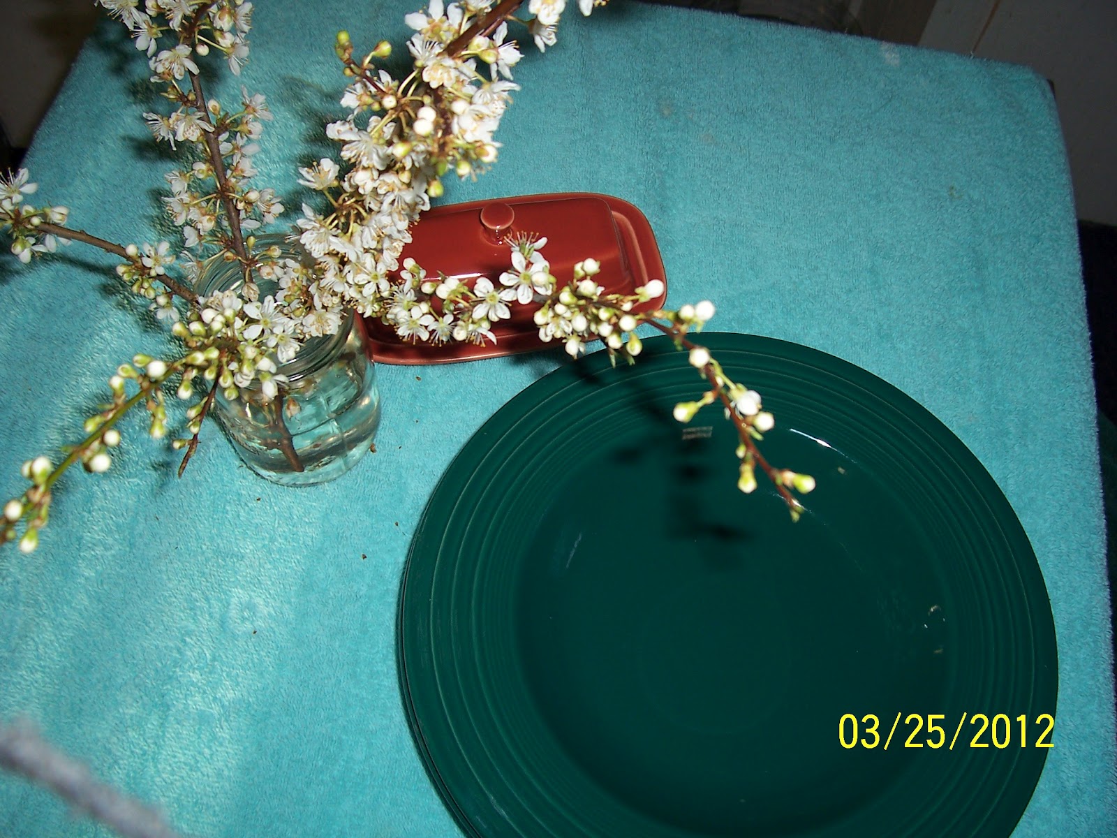
the best part was, it sang when it was paired with Lemongrass. And, best of all, Joseph loved Paprika. It has a terracotta toned brown hue. It feels like a cabin’s warm logs in
firelight. We were on the hunt for a
covered butter dish to start our collection, which Macy’s didn’t have in our
new-found Paprika. So, we took our show
on the road and went to the Fiesta Store on Proctor in Tacoma. Here we not only found a Paprika butter dish,
but Joseph found pasta bowls in Evergreen, a discontinued color that makes a
nice teal-green contrast to the Paprika.
We bought all three pieces, which drained our wallet a little faster
than we expected, which lead to our next thought: we might need to register for
Fiestaware.
But registering should be easy, right? At least we know which colors we like.
No comments:
Post a Comment